
10 Strategies for a Successful UX Project
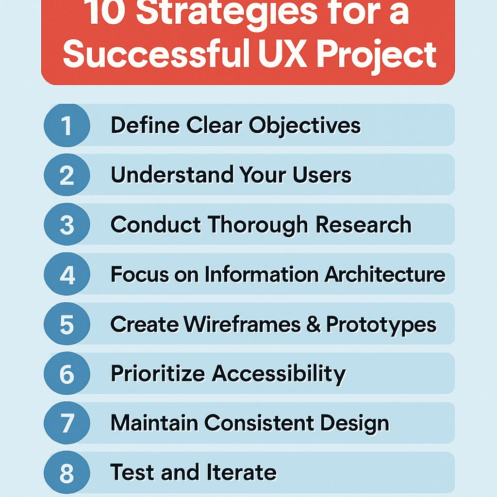
UX projects fail when teams rush into design without strategy. This guide breaks down 10 proven strategies for a successful UX project that UX designers, product managers, and development teams can implement right away.
You’ll learn how to define clear project goals that align stakeholders from day one. We’ll cover comprehensive user research methods that uncover real user needs, not assumptions. Finally, you’ll discover how to build cross-functional team collaboration that keeps everyone moving in the same direction.
These strategies turn chaotic projects into smooth, user-focused wins that deliver results on time and on budget.
Define Clear Project Goals and User Objectives

Establish measurable success metrics
Setting clear, quantifiable success metrics transforms abstract UX goals into concrete targets your team can rally around. Start by identifying both business and user-centered metrics that directly connect to your project’s core objectives. Business metrics might include conversion rates, user acquisition costs, or revenue per user, while user-centered metrics could focus on task completion rates, time to complete key actions, or user satisfaction scores.
Create a measurement framework that tracks both leading and lagging indicators. Leading indicators show progress during development—like usability test scores or prototype feedback ratings. Lagging indicators reveal long-term success after launch, such as customer retention or support ticket reduction. This dual approach helps you course-correct during the project while proving value after delivery.
Document baseline measurements before starting design work. Without knowing where you began, celebrating improvements becomes impossible. Establish realistic targets based on industry benchmarks and your organization’s historical performance, then communicate these expectations clearly to all stakeholders.
Identify target user personas and their pain points
Deep user understanding forms the foundation of every successful UX project. Move beyond surface-level demographics to uncover the real motivations, frustrations, and contexts that drive user behavior. Conduct interviews, surveys, and observational research to build rich, detailed personas that capture not just who your users are, but why they behave the way they do.
Focus on identifying specific pain points within your project’s scope. Generic pain points like “wants things to be easy” won’t guide design decisions. Instead, pinpoint precise friction moments: “Gets confused when choosing between premium plans because pricing differences aren’t clear” or “Abandons checkout when forced to create an account for small purchases.”
Map these pain points to emotional states and situational contexts. A busy parent shopping on mobile during lunch break faces different challenges than a researcher comparing options on desktop over several days. These nuanced insights reveal design opportunities that generic user research often misses.
Align stakeholder expectations with user needs
Successful UX projects bridge the gap between what stakeholders want and what users actually need. Start by documenting all stakeholder priorities, then map them against user research findings to identify areas of alignment and potential conflict.
When business goals clash with user needs, present data-driven alternatives that serve both interests. For example, if marketing wants to add more promotional content but users find the interface cluttered, propose targeted, contextual promotions that appear only when relevant to the user’s current task.
Create shared understanding through collaborative workshops where stakeholders experience user pain points firsthand. Walk leadership through actual user journeys, complete with the frustrations and roadblocks real users encounter. This experiential approach builds empathy more effectively than presentations full of charts and statistics.
Regular check-ins keep everyone aligned as projects evolve. Schedule brief stakeholder reviews at key milestones to confirm that solutions still address original priorities while meeting user needs discovered during research.
Create actionable project scope boundaries
Clear scope boundaries prevent feature creep while maintaining focus on core user problems. Define what success looks like in specific, observable terms, then identify the minimum set of features needed to achieve those outcomes. Document these boundaries in a project charter that all team members can reference when new ideas emerge.
Establish a formal process for handling scope changes. Create evaluation criteria that weigh new requests against project goals, timeline constraints, and resource limitations. This systematic approach helps teams make objective decisions rather than emotional ones when stakeholders propose additions.
Build flexibility into your scope by identifying “nice-to-have” features that can be added if time permits or removed if constraints tighten. Rank these optional features by impact and effort so you can make smart trade-offs when needed. This approach maintains project momentum while accommodating changing priorities.
Conduct Comprehensive User Research

Gather quantitative data through surveys and analytics
Numbers tell stories that opinions can’t. Web analytics reveal exactly how users behave on your platform – where they click, how long they stay, and where they drop off. Google Analytics, Hotjar, and similar tools show you the hard facts about user behavior patterns without any guesswork.
Surveys complement analytics by capturing the “why” behind the numbers. Well-crafted survey questions uncover user motivations, frustrations, and preferences at scale. Tools like Typeform or SurveyMonkey make it easy to reach hundreds or thousands of users quickly. The key is asking specific questions rather than generic ones – instead of “Do you like our website?” try “Which step in our checkout process felt most confusing?”
A/B testing takes quantitative research further by comparing different design solutions with real users. You can test everything from button colors to entire page layouts, letting user behavior guide your decisions rather than internal debates.
Perform qualitative interviews and user observations
Real conversations with users reveal insights that data alone can’t provide. One-on-one interviews let you dig deep into user thoughts, emotions, and pain points. Users often explain their reasoning in ways that surprise design teams and challenge assumptions.
User observations, whether in-person or remote, show the gap between what people say they do and what they actually do. Watching someone struggle with a navigation menu or skip important information reveals usability issues that users might not even mention in interviews.
Contextual inquiries take this a step further by observing users in their natural environment. Seeing how someone actually uses your app during their commute or while multitasking at work provides invaluable context that lab testing misses.
Analyze competitor solutions and market trends
Smart UX teams study the competitive landscape to understand user expectations and identify opportunities. Users develop mental models based on experiences across multiple products, so knowing what patterns they’re familiar with helps inform design decisions.
Competitive analysis isn’t about copying features – it’s about understanding how others solve similar problems and spotting gaps in the market. Document what works well, what doesn’t, and where competitors fall short of user needs.
Industry trends and emerging patterns also shape user expectations. New interaction paradigms, accessibility standards, and technological capabilities all influence what users expect from digital products. Staying current with design communities, case studies, and UX publications keeps your research relevant and forward-thinking.
Build Cross-Functional Team Collaboration

Establish Regular Communication Channels with Developers
Creating strong communication bridges between UX designers and developers prevents costly misunderstandings and ensures design vision translates into functional products. Daily stand-ups, weekly design reviews, and dedicated Slack channels keep everyone aligned on project progress and technical constraints.
Schedule brief but consistent touchpoints where designers can walk through user flows while developers highlight potential implementation challenges. These conversations work best when they happen early and often, not just when designs are “complete.” Consider pairing designers with specific developers on features to build deeper working relationships and shared ownership.
Use collaborative tools like Figma, Zeplin, or Abstract that allow developers to inspect designs, download assets, and leave comments directly on design files. This eliminates the back-and-forth of email threads and ensures specifications stay current.
Create Shared Understanding Between Design and Business Teams
Business stakeholders and designers often speak different languages – one focused on metrics and ROI, the other on user needs and experience quality. Bridge this gap by translating design decisions into business impact whenever possible.
Present user research findings alongside business metrics to show how user pain points directly affect conversion rates, customer satisfaction scores, or support ticket volume. Create simple visualizations that connect design improvements to measurable business outcomes.
Regular design critiques with business stakeholders help them understand design rationale while giving designers insight into business constraints and priorities. These sessions should feel collaborative, not defensive – frame them as joint problem-solving opportunities rather than design approval meetings.
Set Up Efficient Feedback Loops with Stakeholders
Streamlined feedback processes prevent projects from stalling while waiting for approvals or clarifications. Establish clear timelines for stakeholder review cycles and stick to them. If feedback doesn’t arrive within the agreed timeframe, assume approval and move forward.
Create structured feedback templates that guide stakeholders toward actionable input. Instead of collecting vague comments like “make it pop,” ask specific questions about user goals, brand alignment, or technical feasibility.
Use prototype testing sessions to gather stakeholder feedback in real-time rather than relying solely on static design presentations. When stakeholders can interact with designs and see user reactions firsthand, their feedback becomes more informed and aligned with user needs.
Define Clear Roles and Responsibilities for Each Team Member
Ambiguous ownership creates project bottlenecks and team friction. Document who makes final decisions on design direction, technical architecture, and feature prioritization. This doesn’t mean creating rigid hierarchies – it means everyone knows where to go for different types of decisions.
Create RACI matrices (Responsible, Accountable, Consulted, Informed) for major project phases and deliverables. This prevents situations where multiple people think they’re in charge or where important stakeholders get left out of crucial decisions.
Respect each discipline’s expertise while maintaining collaborative spirit. Designers shouldn’t dictate technical implementation details, and developers shouldn’t make unilateral design changes. Business stakeholders provide strategic direction but trust the team’s execution expertise. When everyone operates within their zone of genius while staying connected to the bigger picture, projects flow more smoothly and outcomes improve dramatically.
Develop User-Centered Design Processes

Create detailed user journey maps
User journey mapping transforms abstract user experiences into tangible, actionable insights. Start by identifying key personas and their specific goals, then trace every touchpoint from initial awareness through task completion. Each journey map should capture emotional states, pain points, and opportunities for improvement at every stage.
The most effective journey maps include multiple layers of information: user actions, thoughts, emotions, touchpoints, and backstage processes. Document what users are trying to accomplish, what they’re thinking during each interaction, and how they feel about their progress. Include both digital and offline touchpoints to create a complete picture.
Consider different scenarios within the same journey. A first-time user’s path differs significantly from a returning customer’s experience. Map these variations to understand how your design needs accommodate different user contexts and expertise levels.
Collaborate with stakeholders from different departments when creating these maps. Customer service teams provide insights into common user frustrations, while marketing understands acquisition touchpoints. This cross-functional input ensures your maps reflect real user experiences rather than assumptions.
Build wireframes that solve real user problems
Effective wireframes go beyond layout and structure—they directly address user needs identified through research and journey mapping. Before placing a single element, clearly define what problem each screen or interface component solves for your users.
Start with low-fidelity sketches that focus on content hierarchy and user flow rather than visual design. This approach keeps stakeholders focused on functionality and prevents premature discussions about colors or fonts. Each wireframe should demonstrate how users will accomplish their primary tasks with minimal friction.
Test wireframes early and often with real users. Paper prototypes or simple clickable versions help validate whether your proposed solutions actually work. Pay attention to where users hesitate, get confused, or express frustration. These moments reveal gaps between your intended design and actual user needs.
Document the reasoning behind each wireframe decision. Create annotations that explain why specific elements are positioned where they are, how they support user goals, and what user research findings influenced the layout. This documentation proves invaluable during design reviews and helps maintain consistency across the project.
Design intuitive information architecture
Information architecture forms the invisible foundation that makes or breaks user experiences. Users should never have to think about where to find what they need—the structure should feel natural and predictable based on their mental models.
Start with card sorting exercises involving actual users. Give participants content items and ask them to group related concepts together. This reveals how your audience naturally categorizes information, which often differs from internal organizational structures. Use these insights to build navigation systems that match user expectations.
Create clear hierarchies that guide users from general to specific information. Each level should offer obvious next steps while providing enough context for users to understand their current location within the larger system. Breadcrumbs, clear headings, and consistent navigation patterns help users maintain their bearings.
Test your information architecture with tree testing before building full interfaces. This method isolates navigation structure from visual design, helping you identify whether users can successfully find specific content. Fix structural problems early—they become much more expensive to address after visual design and development are complete.
Consider mobile-first information architecture even for desktop experiences. Touch interactions and smaller screens force you to prioritize content and simplify navigation structures. These constraints often lead to cleaner, more focused architectures that benefit all users regardless of their device.
Implement Rapid Prototyping and Testing

Create low-fidelity prototypes for early validation
Start with paper sketches, wireframes, or simple digital mockups that focus on core functionality rather than visual polish. These quick-and-dirty prototypes cost almost nothing to create but provide massive value in spotting potential issues before you’ve invested significant time in development. Think of them as rough drafts that capture the essential user flow without getting bogged down in colors, fonts, or pixel-perfect layouts.
Low-fidelity prototypes help stakeholders visualize concepts without getting distracted by design details. You can sketch out three different approaches to a checkout process in thirty minutes, test them with users, and identify the winner before writing a single line of code. Tools like Balsamiq, POP, or even hand-drawn sketches photographed on your phone work perfectly for this stage.
The goal is speed and learning, not beauty. Your prototype should answer key questions about user behavior and task completion while remaining flexible enough to change direction quickly based on what you discover.
Test designs with real users frequently
User testing shouldn’t happen once at the end of your project—build it into every sprint and design iteration. Schedule regular sessions with actual users from your target audience, even if it’s just fifteen-minute informal conversations over video calls. These frequent check-ins prevent you from building something users don’t want or can’t understand.
Recruit participants who match your user personas and create realistic scenarios that mirror how they would actually encounter your product. Watch them navigate your prototype while thinking aloud, and pay attention to where they hesitate, click the wrong elements, or express confusion. Their natural reactions tell you more than any survey ever could.
Keep testing sessions short and focused on specific tasks or features. You’ll gather more actionable insights from five users testing one key workflow than from twenty users trying to evaluate your entire product. Record sessions when possible, but don’t let documentation slow down your ability to test frequently and adapt quickly.
Iterate based on user feedback and testing results
Turn user insights into immediate design improvements rather than filing them away for “later consideration.” When three out of five users struggle with the same navigation element, that’s your signal to redesign it before the next sprint. Create a rapid feedback loop where testing results directly influence your next prototype version.
Categorize feedback into quick fixes, medium-term improvements, and major rethinks. Quick fixes might include changing button labels or adjusting spacing, while major rethinks could involve restructuring entire workflows. Tackle quick wins immediately to show progress and build team confidence in the testing process.
Document patterns in user behavior across multiple testing rounds. If users consistently ignore your primary call-to-action button, the problem might be positioning, visual hierarchy, or the button copy itself. These patterns help you make informed decisions about which changes will have the biggest impact on user success.
Use A/B testing for data-driven decisions
When you have competing design solutions and user feedback points in different directions, A/B testing provides the quantitative data needed to make confident decisions. Set up controlled experiments that test one variable at a time—like button color, headline copy, or page layout—with statistically significant sample sizes.
Define clear success metrics before launching any A/B test, whether that’s conversion rates, task completion times, or user engagement levels. Random testing without clear goals wastes time and resources while potentially making your product worse. Focus on testing elements that directly impact your core user objectives and business goals.
| Test Type | Best For | Duration | Sample Size |
|---|---|---|---|
| Button variations | Quick wins | 1-2 weeks | 1,000+ per variant |
| Layout changes | Major redesigns | 3-4 weeks | 2,000+ per variant |
| Content testing | Messaging optimization | 2-3 weeks | 1,500+ per variant |
Run tests long enough to account for weekly usage patterns and seasonal variations, but don’t let perfect become the enemy of good. A 95% confidence level beats endless deliberation that delays product improvements your users need right now.
Maintain Design System Consistency

Establish reusable UI components and patterns
Building a comprehensive library of reusable components forms the backbone of any successful design system. Start by identifying the most commonly used interface elements across your product – buttons, form fields, navigation bars, cards, and modals. Each component should have clearly defined states (default, hover, active, disabled) and variations (primary, secondary, sizes) that cover all possible use cases.
Create a master component library in your design tool that serves as the single source of truth. When designers need a button, they shouldn’t create a new one from scratch – they should pull from this library. This approach dramatically reduces inconsistencies and speeds up the design process. Your developers benefit too, as they can build corresponding code components that mirror the design library exactly.
Document the anatomy of each component, including spacing rules, typography specifications, and interaction behaviors. Include real examples showing proper usage and common mistakes to avoid. This documentation prevents team members from accidentally creating variations that break the system’s cohesion.
Document design guidelines for team reference
Effective design guidelines go beyond just showing what components look like – they explain the why behind design decisions. Create living documentation that covers typography hierarchy, color usage rules, spacing systems, and interaction patterns. Include decision trees that help team members choose the right component for specific scenarios.
Your style guide should address accessibility requirements, responsive behavior, and edge cases that commonly trip up designers and developers. Visual examples work better than lengthy explanations. Show correct implementations alongside incorrect ones to make the differences crystal clear.
Make this documentation easily searchable and regularly updated. When team members can quickly find answers to their questions, they’re less likely to make up solutions that deviate from the established system.
Ensure brand alignment across all touchpoints
Every interaction users have with your product should feel cohesive and reinforce your brand identity. This means your design system needs to capture not just visual elements but also the personality and voice that should come through in micro-copy, animations, and user flows.
Define your brand’s design principles and translate them into concrete design decisions. If your brand is friendly and approachable, your error messages should be helpful rather than technical. If precision and professionalism are key values, your layouts should emphasize clean lines and purposeful white space.
Regularly audit your product to catch inconsistencies before they compound. Create checklists for common touchpoints like onboarding flows, error states, and confirmation messages. Train your team to think about brand alignment during the design process, not as an afterthought during review cycles.
Plan for Technical Feasibility and Constraints

Collaborate Early with Development Teams
Getting developers involved from day one can make or break your UX project. Many design teams make the mistake of working in isolation, only bringing in developers when it’s time to build. This approach often leads to painful compromises and rushed redesigns.
Start by scheduling regular check-ins with your development team during the initial concept phase. Share wireframes and early prototypes to get their input on what’s feasible within your timeline and budget. Developers can spot potential roadblocks before they become major problems, saving you countless hours of rework later.
Create shared documentation that both designers and developers can access and update. Tools like Figma, Sketch, or Adobe XD with developer handoff features help bridge the communication gap. Include technical notes directly in your design files so nothing gets lost in translation.
Consider Platform Limitations and Requirements
Every platform comes with its own set of rules and constraints. iOS has specific interface guidelines, web browsers handle animations differently, and Android devices vary wildly in screen sizes and processing power.
Research your target platforms thoroughly before finalizing design concepts. What works beautifully on a high-end smartphone might crawl on older devices. Web designs need to account for different browsers, screen resolutions, and internet speeds.
| Platform | Key Considerations |
|---|---|
| iOS | Human Interface Guidelines, App Store review process |
| Android | Material Design principles, device fragmentation |
| Web | Browser compatibility, responsive design, accessibility |
| Desktop | Operating system conventions, keyboard navigation |
Don’t fight against platform conventions unless you have a compelling reason. Users expect certain interactions to work in specific ways, and breaking those expectations creates confusion and frustration.
Balance Design Aspirations with Technical Realities
Your design vision might include cutting-edge animations and complex interactions, but the development team has limited time and resources. Finding the sweet spot between ambitious design and practical implementation requires ongoing negotiation and compromise.
Prioritize your design elements based on user impact and business value. That fancy parallax scrolling effect might look amazing, but if it delays the project by two weeks and doesn’t solve a core user problem, it’s probably not worth it.
Create multiple versions of your designs with different levels of complexity. Present a “minimum viable design” alongside your ideal vision. This gives stakeholders options and helps everyone understand the trade-offs involved.
Be open to alternative solutions that achieve the same user experience goals with less technical complexity. Sometimes the development team can suggest approaches you hadn’t considered that work even better than your original idea.
Plan for Scalability and Future Enhancements
Think beyond the current project scope and consider how your design will evolve over time. Will new features be added? How will the interface handle increased user volume or additional content types?
Build flexible design systems that can accommodate growth without requiring complete overhauls. Use modular components that can be combined in different ways as new requirements emerge.
Document your design decisions and the reasoning behind them. Future team members will thank you when they need to understand why certain choices were made and how to maintain consistency as the product grows.
Consider performance implications of your design choices. Heavy graphics, complex animations, and numerous third-party integrations can slow down your application as it scales. Plan for optimization strategies from the beginning rather than treating performance as an afterthought.
Create Effective Communication and Documentation

Present design decisions with clear rationale
Strong design decisions require equally strong explanations. When you present your UX work, skip the “trust me, this looks good” approach and instead walk your audience through the reasoning behind every choice. Your stakeholders need to understand not just what you designed, but why you designed it that way.
Start with the user problem you’re solving. Frame your design decisions as solutions to specific user pain points or business challenges. For example, instead of saying “We moved the navigation to the left sidebar,” explain “User testing revealed that 73% of participants expected to find navigation on the left, and this placement reduced task completion time by 15 seconds.”
Create decision trees that show your thought process. Map out the alternatives you considered and explain why you eliminated certain options. This demonstrates thorough thinking and helps stakeholders understand the trade-offs involved. Include metrics, user feedback, and business constraints that influenced your choices.
Visual storytelling works wonders for design rationale. Before-and-after comparisons, user journey maps with pain points highlighted, and annotated wireframes help people grasp your reasoning quickly. Screenshots with callout boxes explaining specific design elements make complex decisions digestible for non-designers.
Document user research findings and insights
Research documentation serves as your project’s foundation and memory bank. Raw data means nothing if nobody can find it or understand its implications six months later. Create research repositories that team members can actually use and reference throughout the project lifecycle.
Structure your findings around actionable insights rather than just data dumps. Transform “80% of users clicked the wrong button” into “Users expect the primary action button to be green based on learned conventions from other financial apps they use daily.” This approach helps team members connect research to design decisions.
Develop persona documents that go beyond demographics. Include behavioral patterns, motivations, frustrations, and specific quotes from user interviews. These living documents should evolve as you learn more about your users. Regular updates keep personas relevant and prevent them from becoming outdated stereotypes.
Build insight libraries that categorize findings by themes, user segments, or product areas. Tag insights with project phases, dates, and confidence levels. This system allows future projects to build on previous learnings rather than starting from scratch each time.
Maintain version control for design assets
Design chaos happens when multiple versions of mockups, prototypes, and design systems float around without clear organization. Version control prevents the nightmare scenario where developers build features based on outdated designs while you’ve moved three iterations ahead.
Establish naming conventions that everyone understands and follows religiously. Include version numbers, dates, and status indicators in file names. “Homepage_v3_2024-01-15_FINAL” tells a much clearer story than “Homepage_new_updated_final_REALLY_FINAL.”
Cloud-based design tools offer built-in version history, but don’t rely solely on automatic saves. Create manual checkpoints at key project milestones and document what changed between versions. This practice helps team members understand the evolution of your designs and prevents confusion during handoffs.
Create asset libraries that serve as single sources of truth for current design elements. When you update a component or pattern, ensure the library reflects those changes immediately. Notify team members about updates through established communication channels so everyone stays synchronized.
Establish Quality Assurance and Review Processes

Conduct regular design reviews with stakeholders
Design reviews serve as critical checkpoints throughout your UX project, bringing together diverse perspectives to catch issues before they become expensive problems. Schedule these sessions at key milestones rather than waiting until the end when changes become costly and time-consuming.
Create a structured review process that includes project managers, developers, product owners, and end users when possible. Share designs in advance so participants can prepare thoughtful feedback instead of rushing through superficial comments during the meeting. Use collaborative tools like Figma or Miro to allow real-time annotation and discussion.
Document every decision made during reviews, including the reasoning behind changes or rejections. This creates a valuable trail that prevents revisiting settled issues and helps new team members understand the design evolution.
Test designs across different devices and browsers
Cross-platform compatibility can make or break user experience. Your beautiful design might look perfect on your high-end monitor but fall apart on a budget smartphone or older browser version.
Establish a testing matrix that covers your primary user demographics’ most common device and browser combinations. Don’t just test on the latest iPhone and Chrome – include Android devices with varying screen sizes, older browser versions, and different operating systems.
Pay special attention to responsive breakpoints, touch targets, and loading performance across different connection speeds. What feels snappy on your office WiFi might crawl on mobile networks. Use browser developer tools and actual devices to catch issues that simulators miss.
Validate accessibility standards compliance
Accessibility isn’t just about legal compliance – it’s about creating inclusive experiences for all users. Build accessibility testing into your workflow from the start rather than treating it as an afterthought.
Use automated tools like axe DevTools or WAVE to catch common issues like missing alt text, insufficient color contrast, or keyboard navigation problems. However, don’t rely solely on automated testing. Screen reader testing and keyboard-only navigation reveal usability issues that tools miss.
Create accessibility checklists for common interface patterns in your design system. This helps team members consistently apply WCAG guidelines without becoming accessibility experts themselves.
Perform usability testing before final implementation
User testing provides reality checks that internal reviews can’t match. Real users interact with your design differently than you expect, revealing gaps between your mental model and theirs.
Run quick guerrilla testing sessions with 5-6 users to identify major usability issues. Focus on core user journeys rather than trying to test everything. Watch for hesitation, confusion, or unexpected behavior patterns that indicate design problems.
Test early and often with low-fidelity prototypes before investing in polished designs. Paper prototypes or simple clickable wireframes can reveal fundamental navigation issues that are expensive to fix later in development.
Measure Success and Plan for Continuous Improvement

Track Key Performance Indicators Post-Launch
Success in UX projects can’t be measured by gut feelings alone. You need concrete data to understand how well your design performs in the real world. Start by identifying the metrics that directly align with your project goals. If you aimed to reduce checkout abandonment, track conversion rates and drop-off points. For improving user engagement, monitor time on task, feature adoption rates, and user retention.
Set up your measurement framework before launch, not after. This means implementing proper analytics tracking, establishing baseline measurements, and defining what success looks like numerically. Common UX metrics include task completion rates, error frequency, user satisfaction scores (like NPS or CSAT), and time to complete key actions.
Don’t get lost in vanity metrics that look good on paper but don’t reflect real user value. Page views might be high, but if users can’t find what they need, your UX has failed. Focus on behavioral metrics that show genuine user success and business impact.
Gather Ongoing User Feedback and Analytics
Raw analytics tell you what happened, but user feedback reveals why it happened. Create multiple channels for collecting user insights after launch. This includes surveys, user interviews, support ticket analysis, and social media monitoring. Each channel captures different types of feedback – surveys give you quantitative sentiment, while interviews provide rich qualitative context.
Heat mapping tools show you where users click, scroll, and spend time on your pages. Session recordings reveal user behavior patterns you might never have anticipated. These tools often uncover usability issues that traditional analytics miss, like users repeatedly clicking non-interactive elements or getting confused by ambiguous interface elements.
Build feedback collection into your product experience. In-app feedback widgets, post-task surveys, and periodic user satisfaction polls keep you connected to user sentiment. The key is making feedback easy to give without being intrusive. Users are more likely to share honest opinions when the process feels effortless.
Plan Iterative Improvements Based on Real-World Data
Data without action is just expensive storage. Transform your insights into a prioritized improvement roadmap. Start by categorizing findings into quick wins, medium-term enhancements, and major redesign opportunities. Quick wins might include copy changes or button repositioning that can be implemented within days. Bigger improvements require more planning and resources.
Create a feedback loop where insights inform design decisions, changes get implemented, and results get measured again. This cycle should run continuously, not just during dedicated “improvement sprints.” Small, regular updates often deliver better results than massive overhauls that take months to complete.
Build cross-functional collaboration into your improvement process. UX insights need to be shared with product managers, developers, and business stakeholders. When everyone understands user pain points and opportunities, solutions emerge more naturally. Regular review meetings where teams examine user data together create shared understanding and buy-in for necessary changes.
Document your improvement decisions and their outcomes. This creates institutional knowledge that prevents repeating mistakes and helps new team members understand why certain design choices were made. Your future self will thank you when similar challenges arise in other projects.

UX projects succeed when teams focus on users, collaborate well, and stay organized. The ten strategies covered here create a solid foundation: setting clear goals, doing thorough research, working across departments, and building user-focused processes. Testing early and often, keeping designs consistent, and planning for technical realities help avoid costly mistakes down the road. Good communication and documentation keep everyone aligned, while quality reviews catch issues before they become problems.
Success doesn’t end at launch. The best UX teams measure their impact and keep improving based on real user feedback and data. Start with one or two strategies that feel most urgent for your current project, then gradually build these practices into your regular workflow. Remember, great user experiences come from teams that put users first and work together to solve real problems.
Add a Comment